AS 1319 Danger signs use a red 'DANGER' header with concise legend to indicate life‑threatening hazards; place at approaches and hazards.
Not all hazards are equal. Some situations can injure; others can kill. The red‑header safety sign class exists to communicate the highest level of hazard quickly and unambiguously. Understanding the colour panel, symbol choices and short wording helps you brief, order and install signs that people can read and act on in a split second.
This guide explains what the red header means, how colours and symbols work together, when to use this class, and how Sign Portal manufactures robust signs for Australian conditions.
Definition and purpose
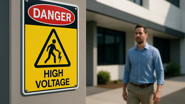
This sign class is reserved for situations where the risk is extreme and the potential outcome is death or serious injury. The design uses a high‑contrast red header to cut through visual noise and trigger immediate caution, supported by a simple symbol and a short, direct legend such as “HIGH VOLTAGE” or “KEEP OUT”.
Use it sparingly. If every sign on site carries the same red header, people will tune out. Reserve this format for hazards that demand instantaneous recognition and decisive action.
Order this product: Custom red‑header safety sign (rigid ACP) — built on durable 3 mm ACP, direct UV‑printed in‑house with optional anti‑graffiti and reflective upgrades. Fast Australian turnaround.
Colour and layout conventions
Australian workplaces commonly follow a consistent visual pattern for this sign class so it can be recognised from a distance and across different sites. While exact specifications must be confirmed against the relevant standards and site rules, the typical elements are:
- Header panel: a red oval containing the word DANGER within a black rectangle. The header sits at the top as the primary attention cue.
- Main field: white background for maximum contrast and clean readability.
- Legend text: minimal wording in black, set large and bold. Prefer a single line if possible.
- Pictogram area: a high‑contrast symbol placed to the left of, or above, the legend so it reads at a glance.
Keep the hierarchy clear: header first, symbol second, short legend last. Avoid extra logos, paragraphs of text, or colour gradients that dilute visibility.
Standards and compliance in Australia
For occupational safety signage, most Australian sites reference AS 1319:1994 Safety signs for the occupational environment. Under AS 1319, a Danger sign is used to indicate a hazard or hazardous condition that is likely to be life‑threatening. The familiar red oval “DANGER” header on a black rectangle above a white field is the recognised format. ISO 7010/ISO 3864 symbols may appear on imported equipment, but AS 1319 remains the prevailing convention for workplaces in Australia unless your PCBU or principal specifies otherwise.
- Legend and layout: keep wording concise; avoid mixed classes (e.g., don’t combine a mandatory blue circle with a danger header on the same panel).
- Reflectivity: where night‑time or vehicle approach is expected, specify retroreflective films that meet AS/NZS 1906.1 class requirements for the environment.
- Placement: follow site WHS procedures and any project‑specific signage plans; a competent person should verify sign class, placement and visibility.
Standards review — what AS 1319 covers (and doesn’t):
- Scope: AS 1319 applies to occupational environments, not road traffic control (which is covered by AS 1742 series) and not emergency lighting/exit signs (AS 2293).
- Pictograms: allowed but not mandatory. If used, ensure clarity at distance and avoid complex artwork. Where ISO 7010 symbols are adopted by client policy, retain the AS 1319 header format.
- Warning vs Danger: reserve red‑header DANGER for life‑threatening hazards. Use yellow hazard signs for other significant risks to preserve priority.
- Reflective classes (AS/NZS 1906.1): use Class 1/1W microprismatic for vehicle approaches/yards and Class 2 (engineer grade) for general visibility where headlights are not the primary light source.
- Typography: AS 1319 does not mandate a specific font; choose bold, highly legible sans‑serif faces with generous x‑height. Avoid condensed fonts that reduce stroke width.
Symbol design principles
Pictograms exist to be read in milliseconds. Over‑detailed artwork, thin strokes or complex shading won’t survive at distance or in poor light. Use clean, vector icons with bold shapes and obvious silhouettes.
- High contrast: solid black forms against white space read fastest.
- Low detail: remove fine lines and textures; thicken strokes.
- Consistency: keep a common visual style across your site to build familiarity.
- No decorative effects: avoid drop shadows, bevels and photographic imagery.
Where a suitable pictogram doesn’t exist, prioritise a short, unambiguous legend. If both are used, the symbol should reinforce, not compete with, the wording.
Appropriate use cases
Choose the red‑header class when the hazard can kill or cause catastrophic harm, and immediate recognition is critical. Typical examples include:
- High‑voltage electrical equipment, switch rooms and substations.
- Explosive atmospheres, blasting zones and magazines.
- Toxic gas areas, oxygen‑deficient or confined spaces.
- Moving plant with crush/pinch zones that can cause fatal injury.
- Overhead loads, drop zones and exclusion areas around cranes.
- Unprotected edges at height or sudden floor openings.
If the hazard is significant but not immediately life‑threatening, a different sign class (such as a yellow triangular warning) may be more appropriate. Correct classification helps workers prioritise risk.
Comparison with other sign classes
The red‑header format communicates the highest hazard level. Yellow triangular warning signs typically indicate a medium hazard where caution is required but the risk is not as extreme. Keeping these classes distinct improves how people scan and react on site.
| Feature | Red header (DANGER) | Yellow triangle (WARNING) |
|---|---|---|
| Risk level | Immediate, life‑threatening or catastrophic harm | Significant hazard requiring caution |
| Primary colour cue | Red header above a white field | Yellow triangle with black symbol |
| Typical use | High voltage, explosives, confined spaces | Trip hazards, forklift traffic, moderate pinch points |
| Legend style | Very short, direct wording (e.g., HIGH VOLTAGE) | Short cautionary statement (e.g., WATCH YOUR STEP) |
| Overuse impact | Desensitisation to critical hazards | Visual clutter if used where no medium risk exists |
Placement and sizing basics
Position signs where the hazard begins, and along approach paths so people see them before they enter the risk zone. Maintain clear lines of sight—avoid obstructions like open doors, stacked pallets or temporary fencing that can block visibility at the crucial moment.
Size should scale with viewing distance and the speed at which people approach. Pedestrian areas typically need smaller panels than plant roadways or large factories. In multi‑level or outdoor sites, larger panels or repeated placement may be necessary to ensure the header and legend remain legible.
- Quick sizing rule‑of‑thumb: for high‑priority safety legends, aim for roughly 6–10 mm of uppercase letter height per metre of viewing distance depending on lighting and background contrast. Increase size for vehicle approaches or poor light.
- Mounting height: typically eye‑level for pedestrians; lift above 1.8 m where vehicles or equipment could obscure the panel. Align consistently across a corridor or fence line.
Visibility check you can do on site: stand at the typical approach distance and verify you can read the legend in under one second without stepping closer. If not, increase size, relocate, or duplicate the sign.
Materials and durability
Choose substrate and print method based on location, lifespan, impact risk and cleaning needs. In Australian conditions—high UV, heat, coastal salt and dust—material choice strongly affects service life and readability.
- Aluminium composite panel (ACP): rigid, dimensionally stable and ideal for long‑term outdoor use. Direct UV print gives crisp symbols and dense blacks. Our standard ACP is 3 mm signage‑grade with 0.2–0.3 mm aluminium skins; FR‑grade options are available on request.
- Aluminium sheet: robust and corrosion‑resistant, often used where mechanical fixing is preferred.
- Polypropylene: lightweight and economical for indoor or semi‑protected areas.
- Corflute: best for short‑term and temporary worksites; easy to cable‑tie to fencing.
- Acrylic or laminates (e.g., traffolyte‑style tags): suited to control panels and electrical labels where small, durable plates are required.
- Reflective films: add visibility at night or low light, especially around roadways and yards. We offer engineer‑grade and high‑intensity options aligned to AS/NZS 1906.1 classes.
- Protective overlaminates: anti‑graffiti and UV‑stable films help resist fading, chemicals and cleaning.
For coastal or mining sites, prioritise UV‑stable inks, sealed edges where possible, and a protective laminate to slow colour shift and scratching.
Specifier note: where FR properties are required internally, ask for FR‑grade ACP and confirm compliance with your building certifier. For harsh chemical washdowns, specify anti‑graffiti overlaminate with a compatible cleaner.
How we manufacture in‑house
At Sign Portal, rigid substrates such as ACP and polypropylene can be direct‑printed on our two Mimaki JFX EX flatbed UV printers (2500 × 1300 mm beds). This process lays down high‑opacity inks for crisp headers, deep blacks and sharp pictograms, then cures instantly for handling and finishing.
Where contour‑cut shapes or rounded corners are needed, panels are registered and cut on our MultiCam SM2412 CNC router for clean, accurate edges. For small plates, tags and intricate plastics, our Trotec Speedy 500 and large‑format 230 W CO2 laser deliver precise engraving and cutting.
For adhesive graphics—such as reflective films or anti‑graffiti overlaminates—we print and contour‑cut on our Roland VG‑640 wide‑format printer/cutter, then laminate and apply to the chosen substrate in clean, controlled print rooms. Australia‑wide shipping is available, including regional and remote delivery.
Quality assurance you can measure
- Colour‑managed workflow: headers and blacks are controlled with X‑Rite device‑based profiling and press checks to maintain contrast and legibility.
- Mechanical accuracy: CNC‑cut hole patterns and radiused corners are jig‑set to repeatable centres for fast, consistent installs.
- Preflight and legibility check: our prepress team validates legend length, icon clarity and safe margins against AS 1319 conventions before print.
- Edge preparation: for harsh sites we can chamfer and seal ACP edges to reduce water ingress and abrasion.
Our acceptance checks: visual contrast verified under 500+ lux lighting, header red uniformity across a batch, symbol stroke weight above minimum threshold for the ordered size, and hole centres measured against the job ticket before dispatch. Each batch ships with a job label for trace‑back and easy re‑order.
Artwork and file setup
Supplying production‑ready artwork speeds manufacturing and reduces the risk of unreadable outcomes. Follow these basics:
- Vector first: provide symbols and text as vector paths (PDF/EPS/AI). Avoid pixel‑based icons.
- CMYK colour: set files to CMYK to better predict printed colour. Spot red and deep black are fine, but convert Pantone references thoughtfully.
- Short legends: keep wording concise; break long phrases across lines only if necessary.
- Font handling: outline fonts, or supply the font files and licences if required.
- Bleed and safe area: include bleed for full‑bleed panels and keep symbols/text within a safe margin.
If you’re unsure, our team can preflight artwork and advise on legibility before printing.
Installation overview
Match the fixing to the surface and environment. Common options include screws with washers into timber or masonry anchors, rivets for metal structures, VHB tape for smooth internal walls, and cable ties for temporary mesh fencing. Use corrosion‑resistant fixings outdoors and ensure the surface is clean and dry before bonding.
Critical safety locations—electrical rooms, blast zones, confined spaces—should be installed or signed off by a competent person familiar with your site’s WHS procedures.
- Typical hole pattern: 4 × corner holes 6–7 mm diameter, 10–15 mm in from each edge suits M5/M6 rivets or screws; add centre holes on long panels exposed to wind.
- Adhesive bonding: for smooth internal surfaces use high‑bond tapes or construction adhesives (e.g., VHB‑type); brace until full cure.
- Stainless selection: use 316 near coasts; 304 inland.
Common mistakes to avoid
- Overuse: applying the red header to every sign devalues urgent warnings.
- Clutter: small text, multiple paragraphs, or unnecessary graphics reduce legibility.
- Poor contrast: grey symbols or tinted backgrounds hamper quick recognition.
- Wrong substrate: short‑term plastics in harsh outdoor zones lead to rapid fade or warping.
- No protection: skipping a protective laminate in graffiti‑prone areas makes cleaning difficult.
Ordering checklist
Before you order, gather the essentials so we can manufacture without delays:
- Hazard description and whether the red header class is appropriate.
- Wording (legend) and symbol choice, plus any language variants if required.
- Size, substrate and whether reflective or anti‑graffiti is needed.
- Fixing method (holes, posts, tape, rivets) and any special edge finishing.
- Quantity, delivery address (including site access notes) and deadline.
Trade customers can streamline repeat orders via the Trade Portal with customer‑specific catalogues and saved artwork.
Ready to order? Configure online: Custom red‑header safety sign (rigid ACP). We’ll preflight and confirm your specification against AS 1319 conventions before print.
Care and replacement
Schedule periodic inspections—especially outdoors—to check for fading, delamination, vandalism, or obstructions. Clean with mild detergent and water; avoid strong solvents that can dull laminates or lift vinyl edges.
Replace immediately if colour contrast is lost, the panel is damaged, or the sign is no longer visible from approach paths. Safety messages must be legible at all times.
Recommended intervals: high‑risk zones monthly, general outdoor quarterly, indoor six‑monthly. Keep a simple log (date, condition, photo) so trends are visible and replacement can be budgeted.
Repair and refurbishment
Not every damaged sign needs a full replacement. For non‑structural issues and where WHS and site rules permit, consider these repair options to extend service life:
- Graffiti removal: if laminated with anti‑graffiti film, use an approved remover per the film datasheet; rinse and dry. Without laminate, use mild citrus‑based cleaners and test in an inconspicuous corner.
- Edge scuffs on ACP: lightly deburr, clean with isopropyl alcohol, then apply a clear edge‑sealing lacquer to reduce moisture ingress.
- Loose fixings: replace with like‑for‑like stainless hardware and oversized washers; if holes have elongated, re‑drill to the next size with backing washers.
- Face abrasion: add a retrofit protective overlaminate if the print is intact but cleaning is frequent. We can supply and apply in‑field kits for flat, accessible panels.
- Reflectivity refresh: if the reflective layer is scuffed but substrate is sound, we can supply a replacement reflective face film to overlay (flat panels only).
Critical note: if the sign’s contrast, message, or structural integrity is compromised—or if it marks life‑threatening hazards—replace rather than repair, and have a competent person verify the outcome.
In‑field overlay method (flat panels):
- Clean and degrease thoroughly; dry completely.
- Lightly key glossy faces with a non‑woven pad if recommended by film supplier; wipe down.
- Hinge the new overlay with low‑tack tape, peel liner gradually and squeegee with firm, overlapping strokes.
- Post‑heat edges per film spec to lock down, then edge‑seal where exposed to pressure washing.
- Direct‑printed ACP panels installed at a regional substation where high salinity demanded UV‑stable inks and sealed edges.
- Temporary corflute panels cable‑tied to site fencing during a short blasting programme, then replaced with long‑term ACP after commissioning.
- Switch room upgrade: increasing legend x‑height from 60 mm to 80 mm improved first‑glance legibility distance by ~20% along the main approach.
- Confined‑space DANGER sets produced with Class 1 reflective and anti‑graffiti overlaminate for a water utility; consistent legibility verified along multiple approach paths.
- Mine‑site exclusion zone signage on 3 mm ACP with CNC‑cut slotted holes for rapid alignment to existing posts, reducing install time per sign by ~30%.
Next step: specify size, substrate and finishes and submit through our configurator: Custom red‑header safety sign (rigid ACP). Our production team will confirm any details that affect compliance or readability before we print.
Related Sign Portal resources: Danger - Keep Out Open Shaft Sign · Danger - Moving Machinery Keep Hands Clear Sign · Danger - 22,000 Volts High Voltage Warning Sign
Frequently Asked Questions
What does the red header actually mean?
It signals an immediate or life‑threatening hazard. Use it where rapid recognition is critical, such as high voltage, explosive risk or confined spaces.
Do I need both a symbol and text?
Use a clear symbol where one exists, paired with a short, direct legend. If no suitable pictogram exists, concise text alone is acceptable.
Which material should I choose for outdoors?
For long‑term outdoor use, ACP or aluminium with UV‑cured print and a protective laminate performs well. Add reflective film for low‑light visibility.
Can I add my company logo?
It’s possible, but avoid crowding the layout. Safety hierarchy must remain clear—header first, symbol second, short legend last.
How big should the sign be?
Scale size to viewing distance and approach speed. Larger facilities and vehicle areas typically need bigger panels or more frequent placement.
Are reflective versions available?
Yes. We can apply reflective films for better night and low‑light performance, especially around vehicle zones and yards.
How long will the print last outside?
Lifespan depends on sun exposure, salt, cleaning and vandalism. UV‑stable inks plus a protective laminate extend durability in Australian conditions.

Keep learning
Related Articles
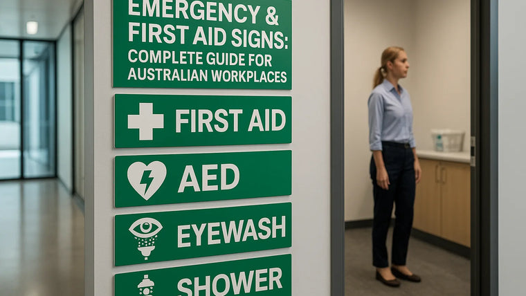
Emergency & First Aid Signs: Complete Guide for Australian Workplaces
Emergency signs clearly mark first aid rooms and kits, AEDs (defibrillators), emergency eyewash and showers, spill kits, emergency phones and fire equipment so people...
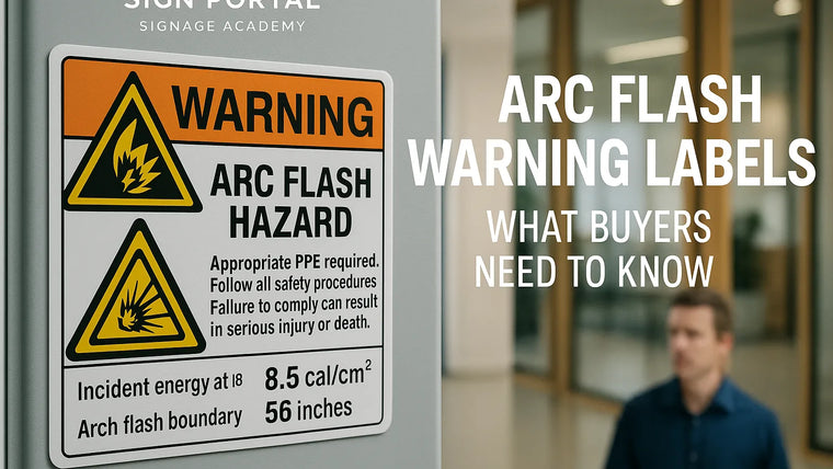
Arc Flash Warning Labels: What Buyers Need to Know
Arc flash warning labels communicate arc‑flash and electric‑shock hazards on switchboards, MCCs and similar enclosures. Content must be derived from a current, documented arc‑flash...
Best Materials for Danger Signs
Best practice by application:- Permanent outdoor danger signs: Use 3 mm aluminium composite panel (ACP) or 1.6–2.0 mm solid aluminium (marine‑grade 5052). Print direct...