In Australia, both are yellow/black hazard signs. Warning flags a specific risk needing prompt action; Caution signals general or lower risk.
Need to flag a hazard fast? This guide explains warning & caution signs—colours, symbols and meaning—for Australian workplaces. It covers how the “Warning” and “Caution” headings differ, how colour and symbols work together, and what to consider for materials, sizing and placement.
Warning & caution signs colours, symbols and meaning explained: quick definitions

Both warning and caution signs are hazard signs designed to grab attention before someone reaches a risky area or begins a hazardous task. They rely on strong colour contrast and simple, unmistakable symbols.
In everyday Australian practice, “Warning” is used where a specific hazard could cause harm if ignored, while “Caution” is often used for general hazards or to ask people to proceed carefully. The difference is about the strength of the alert and the clarity of the specific risk.
Colour conventions for warning & caution signs

Australian safety-sign practice commonly uses a yellow-and-black treatment for hazard warnings so messages can be recognised quickly.
- Background: A solid or high-coverage yellow field attracts attention.
- Symbols and text: Strong contrast helps with fast recognition.
- Borders: A black keyline can improve legibility against complex backgrounds.
- Reflective options: Where visibility at night or in low light matters (e.g. yards, tunnels), consider reflective materials suited to the application.
Colour control at Sign Portal: We can match brand colours for custom signage. Colour appearance can vary between screens, printers, inks, substrates and lighting, so supplying recognised colour references or requesting a printed sample is advisable for critical colour decisions. Where colour accuracy is important, measured checks during proofing can help confirm expectations.
Symbols and pictograms for warning & caution signs
Symbols allow rapid hazard recognition without relying on language. Use simple, familiar pictograms for common hazards such as slips, forklifts, electricity, lasers, hot surfaces and biohazards.
- Keep shapes simple with clear negative space so the symbol reads at a glance.
- Pair the symbol with a short, specific message below to remove ambiguity.
- Avoid decorative graphics or gradients that can reduce clarity or contrast.
- Where a standardised symbol applies, reproducing the recognised form is preferable to creating a decorative alternative.
Wording hierarchy for hazard signs
Good hazard signs follow a predictable reading order so the viewer understands what the risk is and what to do about it within seconds.
- Signal word: A short heading to set urgency.
- Hazard description: Name the specific hazard if relevant (e.g. “Forklifts operating”).
- Consequence or action: State the expected behaviour (“Keep clear”, “Proceed slowly”).
- Supplementary panel (optional): Add detail such as contact, QR codes, or multilingual text if truly needed.
Warning vs Caution: at a glance
The points below reflect common workplace practice.
| Feature | Warning | Caution |
|---|---|---|
| Typical use | Highlights a specific hazard with potential to cause injury or equipment damage if ignored | Advises general care, housekeeping or lower-level hazards where extra attention is needed |
| Primary colour | Yellow background with black symbol/text | Yellow background with black text; may use a symbol where relevant |
| Symbol emphasis | Often includes a pictogram to pinpoint the exact hazard | May be text-led; a symbol can be added if it aids clarity |
| Urgency | Higher alert level; calls for prompt awareness and action | Moderate alert; proceed carefully and follow site practices |
| Examples | Warning – High voltage; Warning – Laser in use; Warning – Hot surface | Caution – Wet floor; Caution – Low headroom; Caution – Keep aisles clear |
| Where seen | Electrical rooms, plant rooms, machinery guards, laboratories | Corridors, loading docks, stairwells, areas under maintenance |
| Reflective need | Consider where the hazard exists in low light or at night | Situational; often non-reflective is sufficient indoors |
Materials and size selection
The right substrate depends on where the sign will live, how long it should last and how it will be fixed. Sign Portal manufactures in-house across multiple materials to suit indoor and outdoor conditions.
- Aluminium composite panel (ACP): Rigid and flat for general sign panels; check any fire-performance or authority requirements that may apply to the site.
- Polypropylene: Lightweight plastic suited to some temporary, promotional and general-purpose signs; select grade and thickness for the actual environment.
- Corflute (fluted polypropylene): Economical for temporary worksites, maintenance zones or short-term housekeeping notices.
- Self-adhesive vinyl labels: Apply to suitable smooth surfaces such as machinery guards, racking uprights and doors when the substrate and adhesive are compatible.
- Reflective films and laminates: Useful where night-time or low-light visibility is important; for regulated traffic applications, follow the relevant road authority requirements and applicable standards.
- Outdoor yards may use rigid panels with reflective elements where after-dark recognition is important.
- Warehouse housekeeping can use lightweight panels for internal reminders.
- Maintenance teams often deploy self-adhesive caution decals for short-term hazards during cleaning or works.
Fixings guidance: Choose between mechanical fixings (screws, bolts, brackets) and adhesive mounting based on the sign size, surface, exposure and required service life. For post-mounted or roadside locations, additional authority requirements may apply.
Material specification tip: Select material thickness, hole sizes, edge finish and fixing layout to suit the sign size, wind exposure, supporting structure and installation method rather than copying a one-size-fits-all approach.
Floor graphics note: Use floor‑graphic media and overlaminates designed for pedestrian traffic and the intended floor surface.
Artwork and legibility
Legibility beats decoration every time. Choose simple fonts, avoid all‑caps paragraphs and leave clear space around the symbol and message.
- Typeface: Use a clean, readable sans‑serif style rather than decorative or condensed faces.
- Contrast: Strong contrast between text/symbol and background improves recognition in varied lighting.
- Hierarchy: Make the heading or key hazard the first focal point, followed by the action line.
- Viewing distance: Increase text and symbol size as viewing distance or speed of approach increases.
Quantified legibility guidance
Practical design choices support fast recognition:
- Size the sign, letters and symbols for the expected viewing distance and approach speed.
- Keep messages concise and avoid clutter so the key hazard and action remain prominent.
- Maintain clear margins around text and symbols so elements are not crowded by edges or fixings.
- Select matte or satin finishes where glare would reduce perceived contrast.
Manufacturing at Sign Portal
Sign Portal manufactures hazard signage in-house in Brisbane, coordinating UV printing for rigid panels with wide‑format print‑and‑cut for decals, plus laser cutting and CNC routing for custom shapes and holes. In‑house production supports custom dimensions, variable artwork and project‑specific materials, and we supply signage Australia‑wide.
Process control and QA:
- In‑house manufacturing allows printing, cutting, engraving and fabrication steps to be checked between stages as part of our quality‑control approach.
- Artwork proofing gives authorised stakeholders an opportunity to check wording, spelling, colours, quantities and layout before manufacture.
- Where reflective or specialist films are specified, selection is matched to the application and project documentation. For regulated traffic signs, the relevant authority requirements and applicable standards should be followed.
- Packaging is planned to protect printed faces, corners, edges and fabricated components during transport.
Placement and visibility
Place hazard signs where they will be seen before people encounter the risk. Avoid locating them behind opening doors, clutter or foliage, and keep placement consistent along routes.
- Mount near the point of decision or entry, not after it.
- Provide an unobstructed line of sight from typical approach angles.
- Use repeaters along long corridors or large yards so the message remains visible.
- Group related safety messages to reduce sign overload and visual noise.
Fixing layout tips:
- Use mechanical fixings for larger or wind‑exposed signs, and ensure fixings suit both the sign material and supporting structure.
- Adhesive mounting is suitable for many labels and lightweight signs when the receiving surface is smooth, clean, dry and compatible with the adhesive.
- Post‑mounted signs should consider post type, wind exposure, footing and the surrounding pedestrian or vehicle environment.
Australian environments and durability
Australian conditions can be harsh on signage. In coastal areas, select corrosion‑resistant structures and fasteners and avoid incompatible metals. Outdoor sign life is influenced by UV exposure, heat, moisture, pollution, cleaning and installation quality, so materials and finishes should be chosen for the actual environment.
Environment notes:
- Coastal: Choose corrosion‑resistant components and consider more frequent inspection and cleaning near marine environments.
- High UV: Durable substrates, suitable inks and protective laminates can improve performance, noting that severe conditions still cause gradual change over time.
- Public‑facing: Anti‑graffiti laminates can make some contaminants easier to remove from printed faces.
Repair, maintenance and lifecycle
Well‑made hazard signs can be serviced in place. A light‑touch maintenance routine helps extend life and preserve legibility.
- Cleaning: Use methods compatible with the substrate, print and laminate. Avoid abrasive pads and aggressive solvents; test unfamiliar cleaners on a small area.
- Graffiti: Anti‑graffiti laminates can aid removal of some paints and markers when used with compatible cleaning products.
- Damage: Replace a sign when fading, cracking, delamination, corrosion, impact damage or wear prevents the message from being read or recognised reliably.
- Inspection: Incorporate signs into routine site checks, considering risk, exposure and any changes to the work area.
- Face replacement: Some systems allow the graphic face to be renewed while retaining a serviceable structure after inspection.
Field repair steps to consider:
- Record the issue and location so the correct replacement can be produced.
- Clean and prepare the surface before applying any replacement decals or overlays.
- Verify legibility from the intended viewing distance, including night checks for reflective signs where relevant.
- Document the action taken and schedule the next review.
Common mistakes to avoid
Many hazard signs underperform because small decisions compromise clarity. Avoid these traps:
- Using decorative fonts or low‑contrast colours that reduce legibility.
- Overloading the sign with too many lines of text.
- Hiding the sign behind equipment, doors or foliage.
- Mixing colour codes that confuse the intended message.
- Skipping a symbol where a pictogram would communicate faster.
- Choosing indoor‑only materials for outdoor, sun‑exposed locations.
Ordering checklist
Before you order, confirm the essentials so your signs arrive ready to install.
- Decide on the heading and message to match the hazard level.
- Confirm the exact hazard wording and any required action line.
- Select material: ACP, polypropylene, corflute or adhesive vinyl; reflective if needed for the application.
- Choose size based on viewing distance and available mounting space.
- Nominate fixing method: pre‑drilled holes, adhesive mounting, cable ties, brackets or other hardware suited to the surface.
- Supply artwork or request templates; include symbol choice and any permitted branding.
- Specify quantities for each location and any serialisation, QR codes or variable data.
Technical sources and standards
- Establishes sign categories, colours and design principles for workplace safety signage.
- Addresses road and traffic-control signage and devices in Australia.
Related Sign Portal resources: Best Materials for Warning & Caution Signs · PV SW Electrical and Warning Label for Solar Installations · Warning - Risk Of Explosion Sign
Frequently Asked Questions
Do I need a symbol or can I use text only?
Symbols are recommended for rapid recognition and to support users with different language or literacy levels. Pair a clear pictogram with a short message for clarity.
What material is best for outdoor hazard signs?
Rigid panels such as aluminium composite panel (ACP) or solid aluminium are widely used for outdoor signage. For temporary or short‑term needs, fluted polypropylene (Corflute) or selected polypropylene panels can be suitable. Material choice should reflect exposure, fixing method and any project‑specific requirements.
How big should my warning or caution sign be?
Size the sign so it can be recognised and read at the typical viewing distance and approach speed on your site. Simpler messages and larger symbols improve readability at longer distances.
Can you ship to regional or remote areas?
Yes. Sign Portal supplies manufactured signage Australia‑wide and can arrange freight for regional and remote delivery.
Can I include my company logo on a hazard sign?
Yes, provided the required safety message, colours and symbols remain prominent and legible. Branding should not replace recognised safety information.
Keep learning
Related Articles
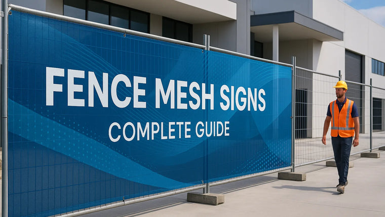
Fence Mesh Signs: Complete Guide
Fence mesh signs are printed mesh banners used on temporary fencing and hoardings. The perforated material allows airflow compared with a solid banner, while...

Best Materials for Crowd Control Barrier Graphics
For most outdoor events in Australia, perforated mesh banner is a versatile option because airflow can help reduce wind effects and it’s quick to...
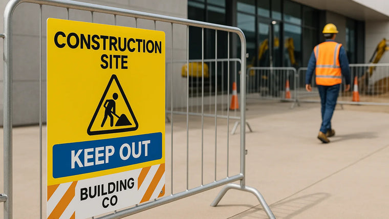
Crowd Barrier Signage for Construction Sites
Crowd barrier signage for construction sites uses panels, banners or decals mounted to portable barriers to guide pedestrians, brand perimeters and reinforce safety messages....